

I’ve long believed that the people who design computer software are the same people who design the taps in restrooms. You know the ones: you simply want to wash your hands but instead of turning on a tap, you’re forced to perform a series of cryptic hand gestures in front of a brushed-steel monolith, only to have the hand drier blast you in the face or hand soap to dispense just to the left of your cupped hands to land in the sink.
And now, Apple has brought this philosophy to your emails with the positioning of the Send button in Tahoe’s version of Apple Mail.
For as long as anyone can remember, the “Send” button in an email app has lived in the top left or there-a-bouts. Where it belongs. It’s sensible. It’s the digital equivalent of a gear stick being between the seats. But in Tahoe, Apple’s designers—who I assume spend their lunch breaks eating deconstructed kale and sitting on chairs that look like giant paperclips—have decided that the top left is “too mainstream.”
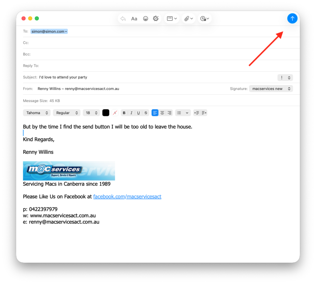
Instead, they’ve taken the Send button and bolted it to the far right of the window.
This is a disaster. If you have a 27-inch monitor, sending a “Thank You” note now requires a mouse journey equivalent to driving from Melbourne to Sydney. You finish typing your message on the left, and then you have to embark on a cross-continental trek across a vast, empty white wasteland of “UI Space” just to find the little blue arrow. By the time you get there, your “thank you for inviting me” email is for a party that is already over.
Fortunately, you don’t have to live like this. You can move the button back to where Steve Job’s would want it to be. It’s actually quite simple, provided you know where the secret handshake is:
Open a new message window (the thing you use to actually write an email).
Right-click (or Control-click) anywhere on the empty gray bar at the top (the Toolbar).
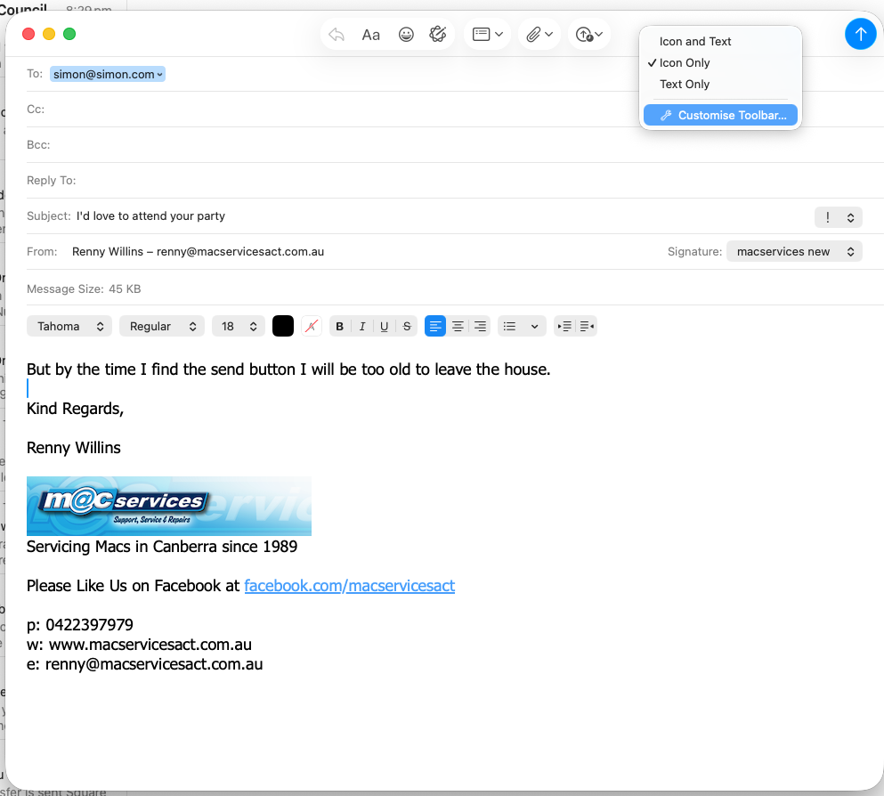
Select “Customise Toolbar…” from the menu.
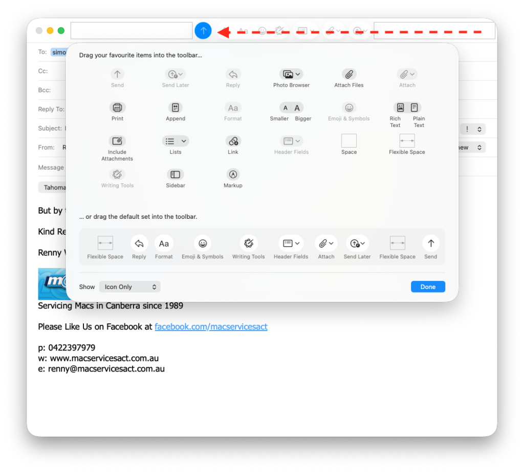
A window will drop down with all sorts of icons. Simply grab that wayward Send button and drag it back to the left.
If you’re feeling particularly organised, you can even drop a “Space” or “Flexible Space” in there to keep things tidy.
Click “Done,” and suddenly, the world makes sense again.
This isn’t the first time Apple has played “Hide the Essential Feature.” If you recall my rant back in October, I pointed out that the “Get Mail” button—a fairly fundamental part of an app designed for, you know, getting mail—had also vanished into the ether.
It’s as if Apple is trying to turn the simple act of communication into a cryptic puzzle. “Oh, you want to read your messages? How quaint. Why don’t you spend twenty minutes searching through the ‘View’ menu instead?”
It’s madness. What is next? Invisible Sent Items folder?
Apple, please. Stop moving things. If I wanted to spend my afternoon looking for things that aren’t where I left them, I’d just go home and try to find my car keys.
Recent Comments